Este es un lenguaje que sirve para darle color y forma a tu página web. Como habéis visto en el html, ya hemos incluido Picnic CSS en la web para partir de una base sobre la que construir el resto del estilo. Hay muchas librerías parecidas, incluyendo la famosa pero compleja Bootstrap.
El CSS siempre modifica al HTML, no puede existir de forma independiente al mismo.
Selectores y propiedades
Para saber a qué elemento modifica, se utiliza lo que se llama un selector, y cada una de las definiciones de estilos que se hacen se llama una propiedad. Por ejemplo, para darle margen a todos los párrafos:
p {
  margin: 5px;
}
El selector es la p que se encuentra en la primera línea. Lo que hace es seleccionar todos los elementos de tipo párrafo del html.
Después del selector encontramos las llaves {} que rodean todas las propiedades que queramos definir para los elementos seleccionados.
Las propiedades son parejas de nombre: valor; , que en este caso sólo es margin: 5px;. Aquí lo que estamos indicando es que todos los párrafos de la web tienen un margen de 5px.
También se pueden añadir varias propiedades para un mismo selector, por ejemplo cambiando el color de fondo:
p {
  margin: 5px;
  background: rgb(200, 100, 100);
}
Clases
Hay varios tipos de selectores. Como recordaréis de la lección anterior, las clases indicamos que tenían un significado especial. Por ejemplo, para este HTML:
<section class="flex three> <div class="hello">Hello</div><div class="hello world">Hello world</div> <div class="bye">Bye</div> </section>
Vamos a darle estilo con CSS (Cascade Style Sheet). Para darles estilos a las clases usaremos el nombre de una de las clases del HTML precedido por un punto .:
/* Estilo para todos los <div> */
div {
  background: red;
}

/* Estilo para todos los elementos con la clase "hello" */
.hello {
  background: green;
}

/* Estilo para todos los elementos con las clases "hello" y "world" */
.hello.world {
  background: blue;
}
Resumen rápido: podemos seleccionar un elemento tipo <p> ... </p> con el selector p, sin embargo para seleccionar un elemento con una clas como <a class="important"> ... </a> tendrás que usar el nombre de la clase precedido por un punto como en .important.
Ejercicio: para el siguiente bloque de HTML, haz que todos los links <a> ... </a> parezcan botones. Pista: usa Google para buscar "CSS Button":
<p>Should you <a href="#clickme">click it</a>? asked Alice, incredulous.</p>
<p>At least push the <a href="#redbutton">red button</a>! Se demanded.</p>
Ejercicio (avanzado): para el siguiente HTML, darle algún estilo sólo a los párrafos con la clase "quote":
<p>This is a plain paragraph</p>
<p class="quote">This is a styled quote</p>
<a class="quote">this should have no style (;</a>
<div>Good luck!</div>
Layouts
Las págnas web se suelen diseñar de las estructuras más generales (Layouts) a los detalles específicos. Algo básico que tenéis que saber hacer es crear y probar varios layouts de forma rápida. Esto es un Layout:
Cuando lo queremos hacer en HTML+CSS, primero tenemos que tener en cuenta las partes más generales, por lo que resulta mucho más sencillo:
Veamos cómo hacer este "sencillo" layout. Ya que es genérico, usaremos el elemento <div> y clases para hacer la estructura. Primero la línea que lo rodea todo:
<div class="gallery"><!-- Everything else goes here --> </div>
Como vemos, le asignamos la clase gallery para el contenedor. We will need to remember this class for giving it style later on. Then, each of the components will have the class element:
<div class="gallery"><div class="element">A</div> <div class="element">B</div> <div class="element">C</div> </div>
Right now our elements don't have any style or content. Let's give it to them. While we could do it with CSS, we'll be using Picnic CSS to make it easier. For this, we will need a class called flex on our gallery and div elements inside of it:
<div class="gallery"> <div class="gallery flex three"><div> <div class="element">A</div> </div> <div> <div class="element">B</div> </div> <div> <div class="element">C</div> </div> </div> </div>
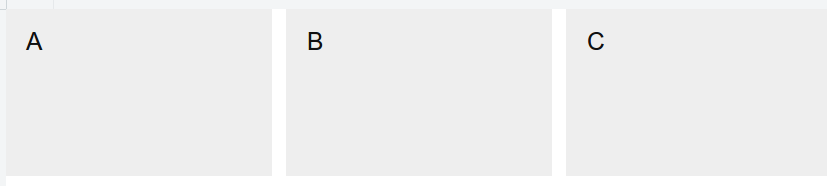
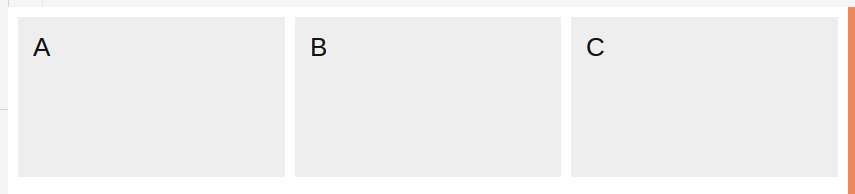
Check it out in this jsfiddle. There we can see the three letters spaced horizontally. However we cannot see it clearly. Let's give some basic style to the elements to see them better:
.element {
  background: #eee;
  padding: 10px 15px;
  height: 120px;
}
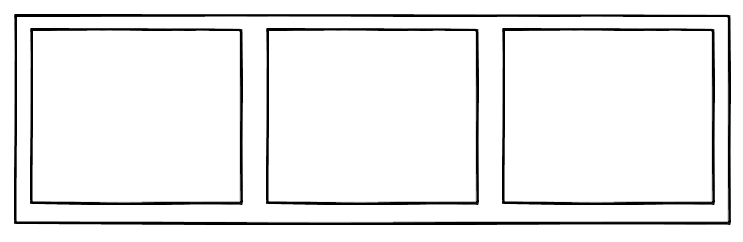
You can see how it looks in this jsfiddle. It looks a lot more like our general layout:
So now let's add some separation around the gallery. For this we will be using the properties margin on the element with the class .gallery:
.gallery {
  margin: 10px;
}
It looks like this:
You can see it in this jsfiddle.
Box Model
There are three different things that can go around your element and they change the size of it. Let's see their representation first:
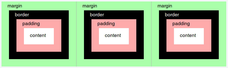
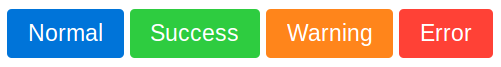
The margin is the outer-most space, and it mainly spaces the distance from one element to the next one. For example, these buttons are separated with margins:
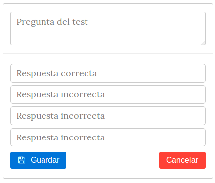
Then there is the border. This is a visual element that surrounds your element. For example, input boxes <input> use this normally and here you can see many:
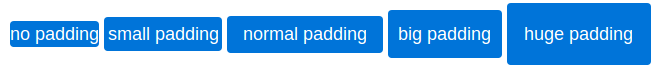
Finally, the padding represents the space from the border to the content itself. If the background of the element is set, the padding will be filled with color but the margin will not. Example of different paddings:
Note that line-height also affects the height, that's why we see that even that no-padding seems to have a bit of vertical padding (but it's not padding).
Next, we will focus on building the elements. For this, we will also be using HTML, but we will focus on the first one and then we'll continue with to the rest.
So what is inside our element? It seems that we want one image and two buttons. So let's do it:
<div class="element">
  <img src="http://placekitten.com/320/240">
  <button>Like</button>
  <button>Dislike</button>
</div>
But we have a problem, now we have two buttons but no way of giving style to only one and not the other. To solve this, we will add them different classes:
<div class="element">
<img src="http://placekitten.com/320/240">
<button class="like">Like</button>
<button class="dislike">Dislike</button>
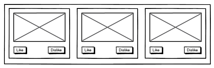
</div>And here you go:
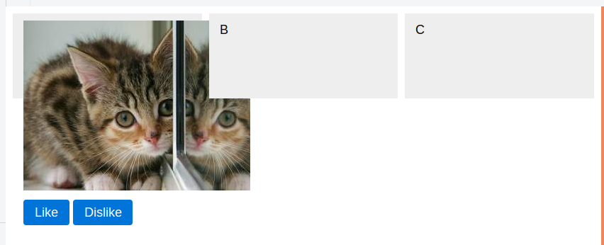
Oops. Not so quick. What is the matter? Well, there are two issues so far:
- The image loads with the original size of the image. We were even lucky because we chose one similar to the displaying size, but it could be thousands of pixels. So we will set the width of the image.
- The height of the .element is forced to 120px because of the property height: 120pxthat we specified before. Normally, in CSS we won't specify heights and we will allow for the elements to size themselves. So we just remove this property.
Sizing things
Setting the width of objects is not so easy. Many times you want it to be 100%, so that the objects like images adjust to the width of the container. In this way, if a screen is larger it will become larger, not leaving empty spaces.
However, some times we want the elements to size themselves such as the buttons or the heights of the objects, so we will not set them. Lastly, some times you want an object to be of an specified size in pixels. This is useful for things like icons.
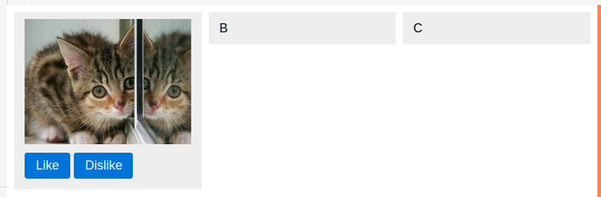
When we set the width of an image to 100%, the height will be automatically set so that it keeps the proportions. After fixing both of the mistakes explained above, we have this CSS:
.gallery {
  margin: 10px;
}

.element {
  background: #eee;
  padding: 10px 15px;
}

img {
  width: 100%;
}
Which makes the HTML to look like this:
The last thing that we need is to make sure that the Dislike button is on the right. Probably we also want it to be red, so we will do so with CSS:
.dislike {
  float: right;
  background: red;
}
Then we copy/paste* our element in the three of them so we get the expected layout. We used a small sizing trick to keep the kitten images different:
*we will learn later on how to do this properly
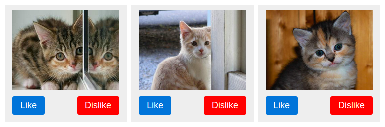
Enjoy the cats. Here you have the full code:
<div class="gallery">
  <div class="flex three">
    <div>

      <div class="element">
        <img src="http://placekitten.com/320/240">
        <button class="like">Like</button>
        <button class="dislike">Dislike</button>
      </div>

    </div>
    <div>

      <div class="element">
        <img src="http://placekitten.com/320/240">
        <button class="like">Like</button>
        <button class="dislike">Dislike</button>
      </div>

    </div>
    <div>

      <div class="element">
        <img src="http://placekitten.com/320/240">
        <button class="like">Like</button>
        <button class="dislike">Dislike</button>
      </div>

    </div>
  </div>
</div>
The CSS:
.gallery {
  margin: 10px;
}

.element {
  background: #eee;
  padding: 10px 15px;
}

img {
  width: 100%;
}

.dislike {
  float: right;
  background: red;
}
Now that you know the basics about layouts with HTML and CSS, you can begin to create your own layouts.
Exercise: create these layouts in HTML+CSS in a similar way to the cats layout: